autothemer
- Description
- Conveniently define themes
- Latest
- autothemer-0.2.18.tar (.sig), 2024-Mar-31, 200 KiB
- Maintainer
- Jason Milkins <jasonm23@gmail.com>
- Atom feed
- autothemer.xml
- Website
- https://github.com/jasonm23/autothemer
- Browse ELPA's repository
- CGit or Gitweb
- Badge

To install this package from Emacs, use package-install or list-packages.
Full description
Autothemer

Autothemer provides autothemer-deftheme a macro wrapper for deftheme and
custom-theme-set-faces which creates a custom color theme.
The package also includes useful theme development features see below.
News
We've added new things to AutoThemer in recent weeks:
- Color distance is using CIELAB colorspace and CIE DE2000 distance algorithm.
- As a result all missing face commands generate better color matches from the theme palette.
- Colors which use color names (Red1, Burlywood and other gems. now get color matched properly.)
- You can interactively insert a single face spec from the un-themed / missing theme specs, with approximated colors as noted above.
- Updates to the list of themes using autothemer (More to come...)
- Theme Variant Architecture/TVA A convention for developing themes with multiple versions.
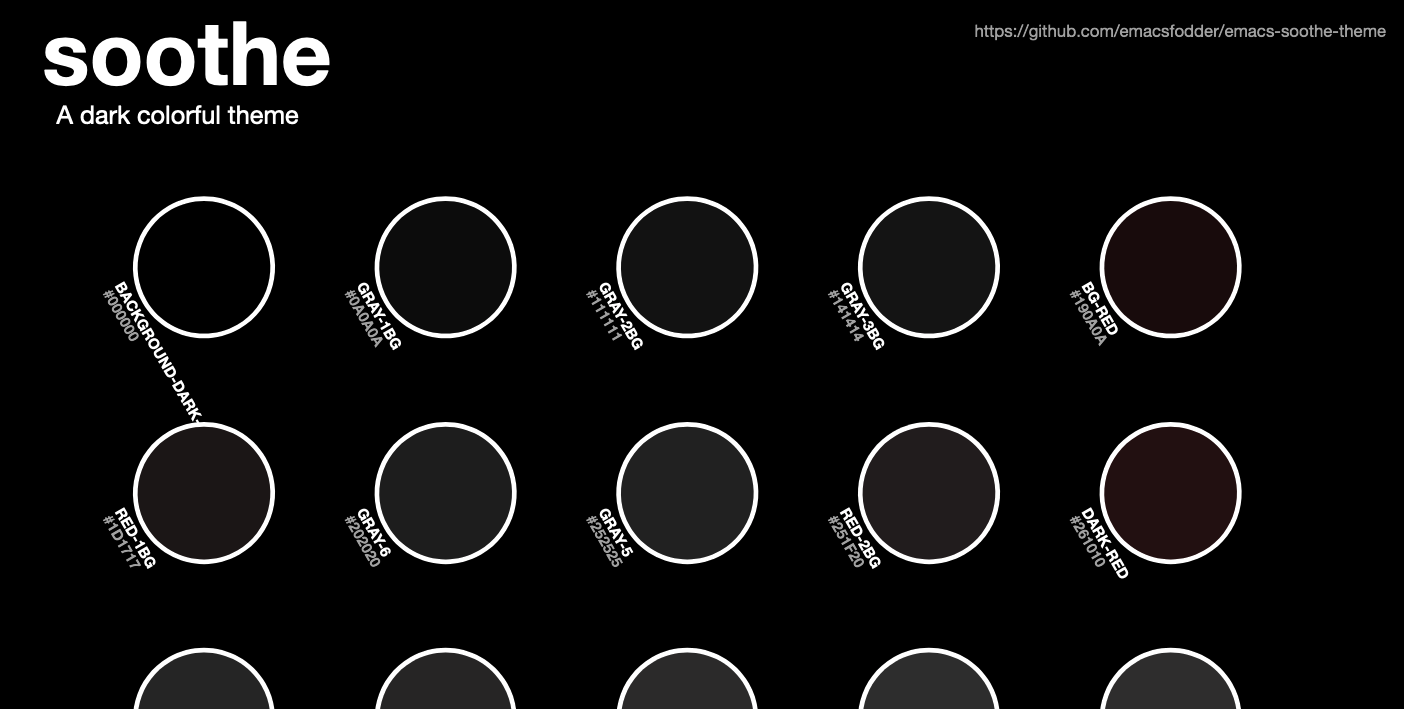
- Generate a cool SVG Palette image Generate a cool SVG Palette image like this one...
- Select colors from the theme in development Select, and insert a palette color name, or it's color value.
- Colorize palette color names
- Autothemer-let-palette macro
- Generate missing specs, updated to allow filtering
Overview
autothemer-deftheme uses a color class(es)/palette(s) which simplify the deftheme style and
simplified face specifications to be applied to Emacs faces.
See the example below.
```lisp (autothemer-deftheme example-name "Autothemer example..."
;; Specify the color classes used by the theme ((((class color) (min-colors #xFFFFFF)) ((class color) (min-colors #xFF)))
;; Specify the color palette, color columns correspond to each of the classes above.
(example-red    "#781210" "#FF0000")
(example-green  "#22881F" "#00D700")
(example-blue   "#212288" "#0000FF")
(example-purple "#812FFF" "#Af00FF")
(example-yellow "#EFFE00" "#FFFF00")
(example-orange "#E06500" "#FF6600")
(example-cyan   "#22DDFF" "#00FFFF"))

;; Specifications for Emacs faces.
;; Simpler than deftheme, just specify a face name and
;; a plist of face definitions (nested for :underline, :box etc.)
((button (:underline t :weight 'bold :foreground example-yellow))
 (error  (:foreground example-red)))

;; Forms after the face specifications are evaluated.
;; (palette vars can be used, read below for details.)

(custom-theme-set-variables 'example-name
    `(ansi-color-names-vector [,example-red
                               ,example-green
                               ,example-blue
                               ,example-purple
                               ,example-yellow
                               ,example-orange
                               ,example-cyan])))
```
Faces and Color Classes
One of the things that makes writing themes for Emacs painful is the syntax of defface,
the macro used to configre Emacs face definitions.
Because the syntax isn't developer friendly it usually results in themes with limited support. Especially for different color displays. Usually GUI / 24bit themes are made, and the results in the terminal are often sub par. On occassion a theme does appear that provides better support for multiple display types, but due to the manual work involved in adding face specs, mode support is limited and development often stalls.
On the plus side the complexity of face specifcations means we can in theory design themes that support any display with any number of colors, we can support dark and light background modes. Until now it's been hard to fully exploit the potential.
Autothemer attempts to solve the problems that a theme developer faces. By defining a simple set of color class rules we can remove repetitive face specs.
Looking again at the example above.
lisp
(((class color) (min-colors #xFFFFFF))
 ((class color) (min-colors #xFF)))
Here we've setup a color class for 16.8million (0xFFFFFF) color display i.e. 24bit,
which will be read from first column in the palette. Next we setup a color class for 256 (0xFF) color
displays i.e. xterm-256color, the color palette values for this will be read from
the corresponding second column.
We can setup as many columns as we'd like to support, here's a few more examples.
For a two color display:
lisp
((class color) (monochrome)))
For a light background 24bit
lisp
((class color) (min-colors #xFFFFFF) (background light))
For a dark background 24bit
lisp
((class color) (min-colors #xFFFFFF) (background dark))
You can read more about defining faces in the Emacs manual, display types and class color is covered here.
Palette
The palette definition is specified as a list of lists, each of the nested lists is a color name and then color values that correspond to each of the display/color classes defined above.
You can set color values as nil and the first color to the left will be used.
For example, if we have three display classes defined, 256, 24bit, 16 color:
```lisp ((((class color) (min-colors #xFF)) ((class color) (min-colors #xFFFFFF)) ((class color) (min-colors 16)))
;; We define my-red in 256 color mode only. (my-red "#FF0000" nil nil)) ```
Note we only specify 256 color mode's my-red value, and leave the
others as nil. Autothemer will copy the value #FF0000 to the other
color classes at the same paletee index if they are nil.
Simplified face specs
In a regular theme (created with the deftheme macro) we have to
specify faces with the display attributes included for every face.
Autothemer's primary purpose is to reduce this down to a minimum.
As we can see in the example above face specs now look like this:
lisp
;; specifications for Emacs faces.
((button (:underline t :weight 'bold :foreground example-yellow))
 (error  (:foreground example-red)))
color names from the palette can be used directly, as we can see here.
The faces are using colors named example-yellow and example-red.
One important thing to remember is that we are in a different context
to deftheme so symbols like bold or faces we want to :inherit
from must use the ' quote-mark. (See the example above 'bold would
usually not be quoted.) The following face attributes will be
affected.
:inherit:weight:slant:style
(NOTE: there may be others I have missed. Please open an [issue] if you find another attribute that needs quoting.)
Body / Evaluated Forms
After defining the display specs, palette and simplified face specs, you can include other code to be evaluated.
Be aware that colors named in the palette will need to be ,
comma-ed so they evaluate correctly. For example if you wanted to use
the color my-red somewhere in the body section, you would refer to it
as ,my-red, so that it's evaluated properly.
Auto generating missing specs
You can automatically generate specs for faces that are not in your theme using the command
M-x autothemer-generate-templates
There's an alternative command to use if you'd like to filter by regexp.
M-x autothemer-generate-templates-filtered
These commands will create a new buffer with simplified specs for all the unthemed faces (or the subset you filtered by). Colors will be selected from the theme palette based on the nearest RGB distance to the un-themed color.
Re-using the color palette
While autothemer doesn't export the defined color variables for external
use, you can define simple advice on autothemer-deftheme to do so:
lisp
(define-advice autothemer-deftheme (:before (_ _ palette &rest _) defcolors)
  (mapcar (lambda (e)
            (setf (symbol-value (car e))
                  (cadr e)))
          (cdr palette)))
If you place the advice definition before the autothemer-generated theme
is loaded, e.g. my-red from the example above will be available as a
variable that can be used in other parts of your emacs configuration.
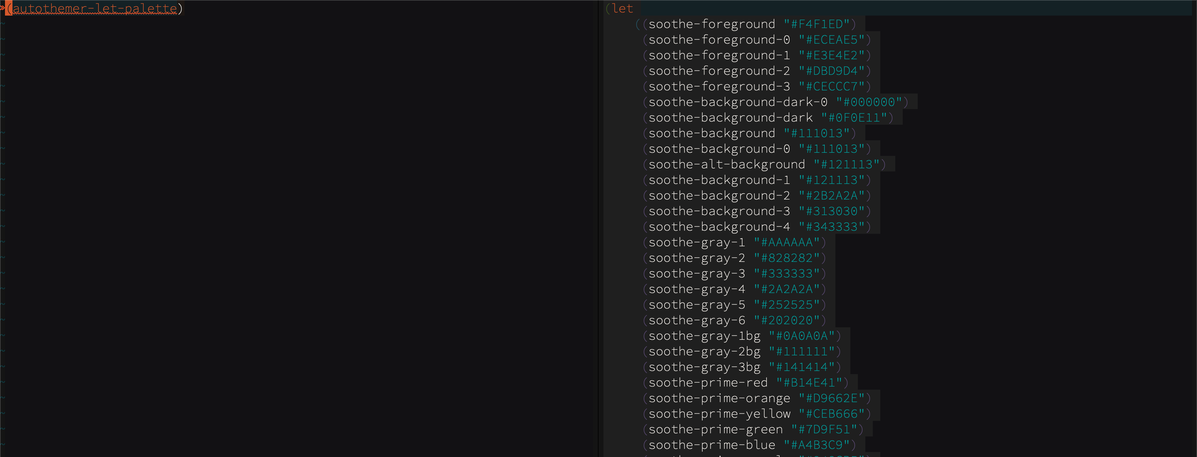
Let palette
Alternatively you can create a let-like block using the macro autothemer-let-palette.
You will need to load/eval the required autothemer theme source (not byte-compiled), before
executing it.
The palette color values will autocomplete, and you can check the palette
with M-x macrostep-expand(place the cursor to the left of the macro call.)
Colorize color-names from the palette
Color names in the palette can be colorized, in any buffer.
Make sure there's a current theme in autothemer--current-theme (eval your autothemer based theme from source, not byte-code) and use:
M-x autothemer-colorize
For example, with Soothe Theme viewing soothe-tva.el:
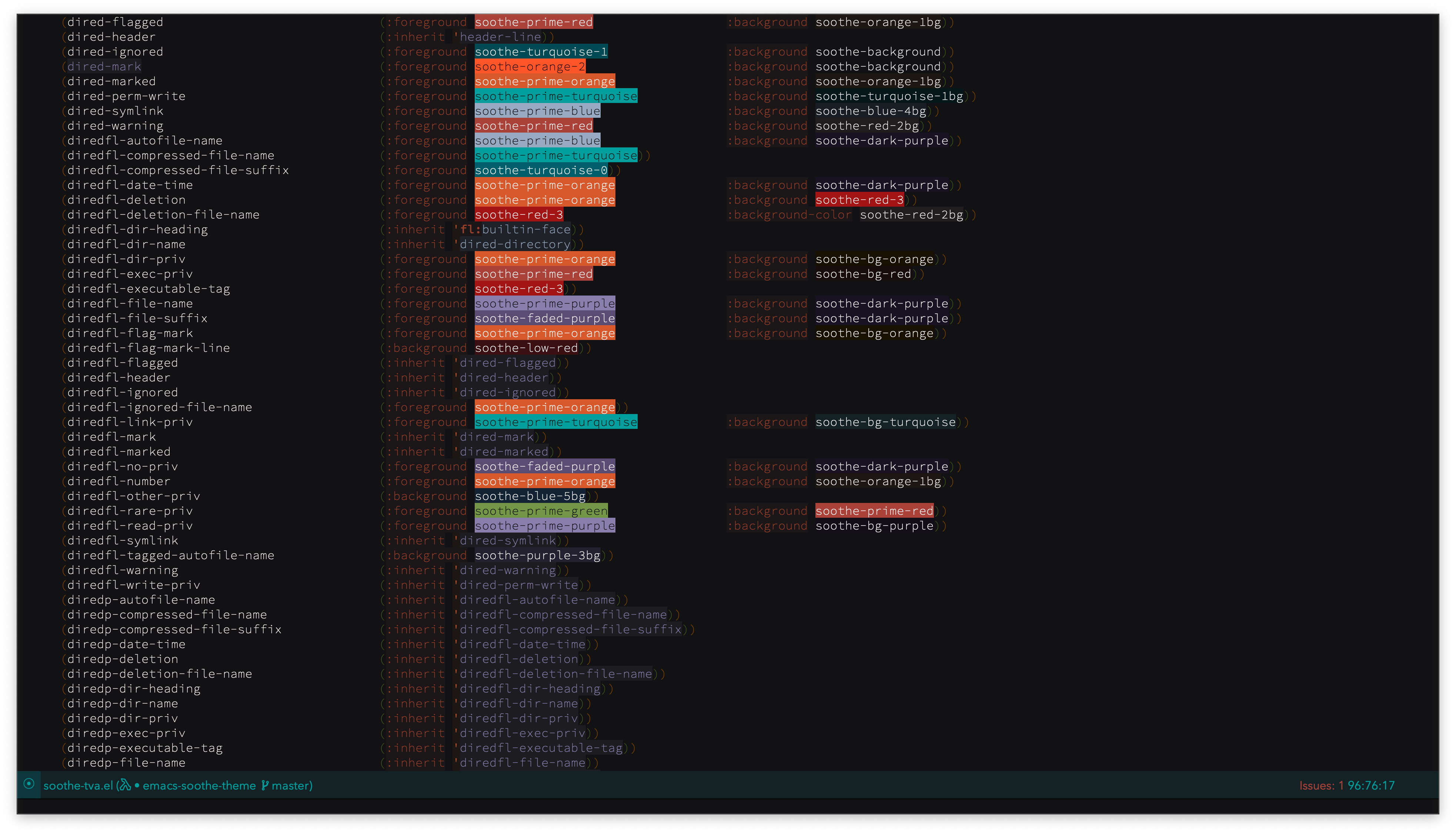
For even more feedback, install and use the excellet Fontify-Face so you can see the current face definitions too.
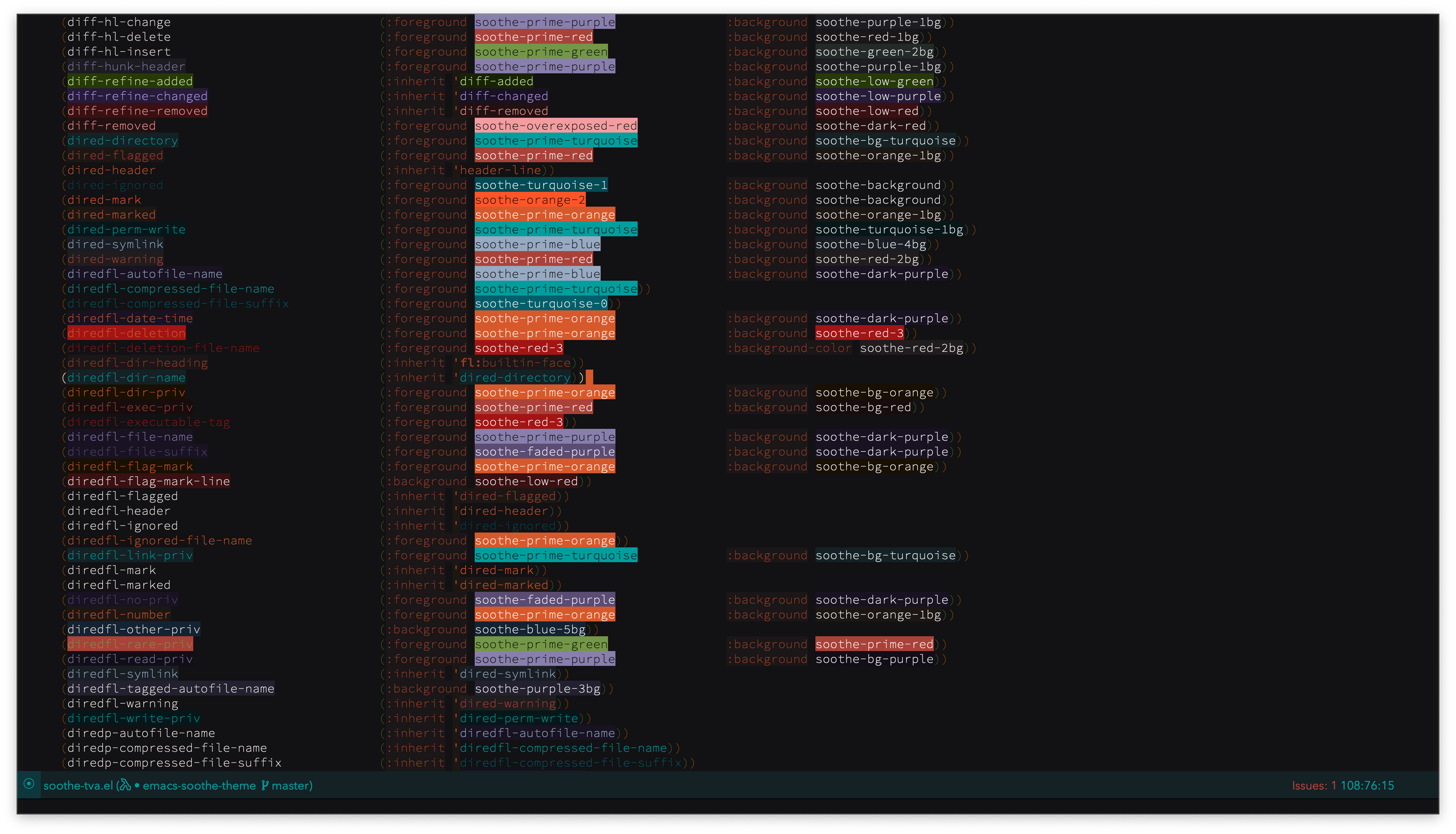
In these images rainbow-mode is also swiched on, so we can see hex colors and system palette names colorized.
M-x rainbow-mode
To edit colors interatively Kurecolor will serve you well.
Select colors from the palette
Since version 0.2.8 it is possible to select a color from the palette (using the completing-read style.)
autothemer-select-color returns an autothemer--color struct (name,value)
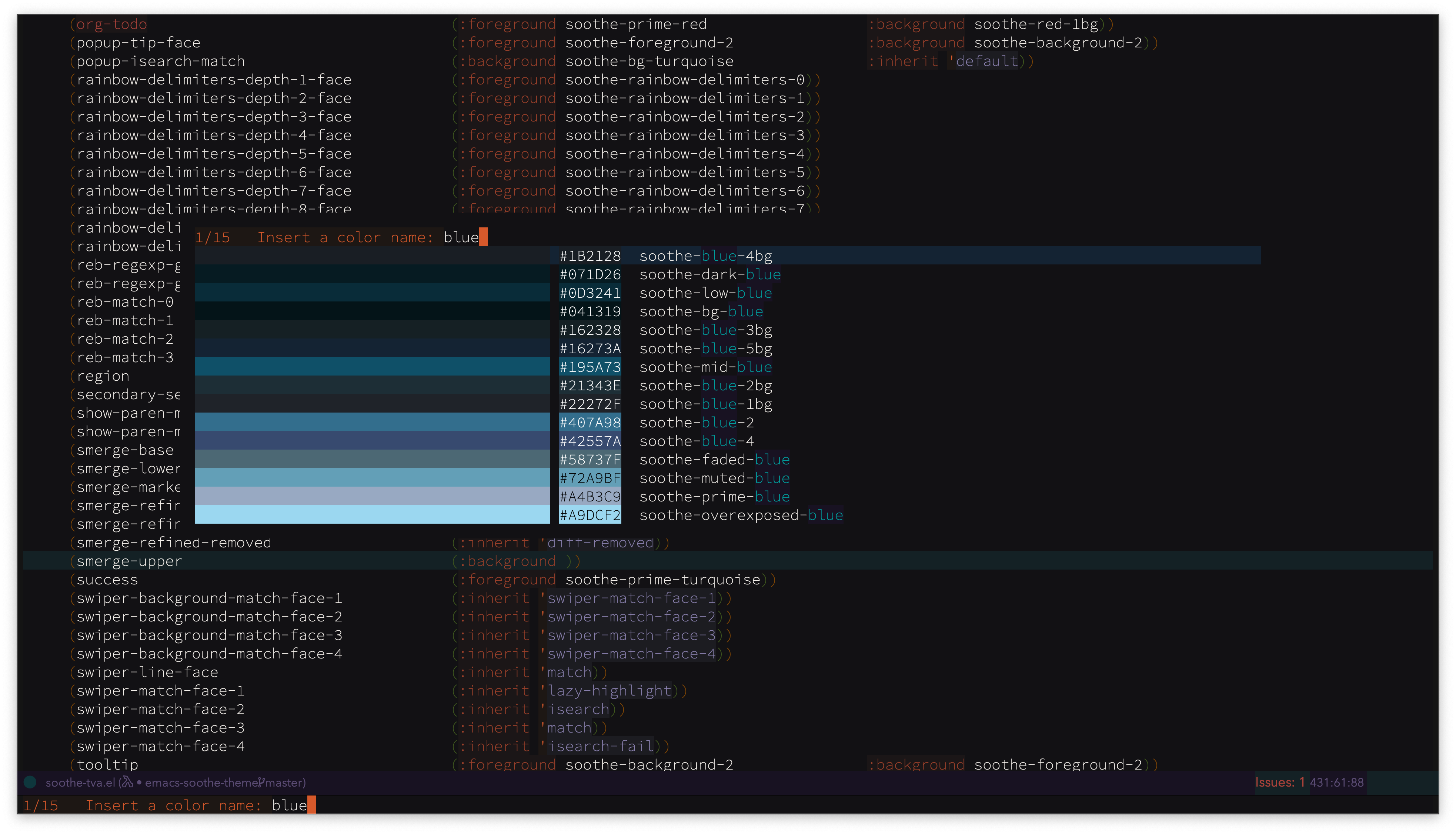
There are also commands to insert a selected color name or it's value.
M-x autothemer-insert-color-name
and...
M-x autothemer-insert-color
If autothemer--current-theme is nil, you'll need to eval an autothemer based
theme before use.
Generate a SVG image of the palette
You can generate a SVG image of a theme palette:
Using autothemer-generate-palette-svg interactively, emacs will ask for the relevant parameters required. You can use options (a plist) to provide some or all of the required options.
For example:
lisp
(autothemer-generate-palette-svg
'(:theme-file "path/folder/my-autotheme.el"
  :svg-out-file "path/folder/my-autotheme-palette.svg"
  :bg-color "#190700"
  :text-color "#FFE0C0"
  :text-accent-color "#90776C"
  :swatch-height 160
  :swatch-width 120
  :theme-name "Orangey Bits"
  :font-family "Helvetica Neue"))
autothemer-generate-palette-svg options
| Option | Description |
|---|---|
theme-file |
Theme filename |
theme-name |
Override the title found in :theme-file |
theme-description |
Override the description found in :theme-file |
theme-url |
Override the url found in :theme-file |
font-family |
Font name to use in the generated SVG |
columns |
Number of columns for each palette row (default: 6) |
bg-color |
Page background color |
text-color |
Main text color |
text-accent-color |
Accent text color |
page-template |
See page-template below |
page-top-margin |
Top margin of page (Default: 120) |
page-right-margin |
Right margin of page (Default: 30) |
page-bottom-margin |
Bottom margin of page (Default: 60) |
page-left-margin |
Left margin of page (Default: 30) |
swatch-template |
See swatch-template below |
swatch-border-color |
The border color of a color swatch |
swatch-width |
Px spacing width of a color swatch (default: 100) |
swatch-height |
Px spacing height of a color swatch (default: 150) |
swatch-rotate |
Degrees of rotation for swatch (default: 45) |
h-space |
Horizontal-space between swatches (default: 10) |
v-space |
Vertical-space between swatches (default: 10) |
sort-palette |
Arrange palette using a function see below |
svg-out-file |
The file/pathname to save SVG output |
For advanced customization the options :page-template and :swatch-template,
can supplied as customized SVG templates.
Note: Template parameters are format style, we mark them as follows:
| Param | name |
|---|---|
%1$s |
width |
%2$s |
height |
%3$s |
font-family |
%4$s |
text-color |
%5$s |
text-accent-color |
%6$s |
bg-color |
%7$s |
theme-name |
%8$s |
theme-description |
%9$s |
theme-url |
%10$s |
swatches |
The builtin page template
svg
<?xml version="1.0" standalone="no"?>
<!DOCTYPE svg PUBLIC "-//W3C//DTD SVG 1.1//EN"
          "http://www.w3.org/Graphics/SVG/1.1/DTD/svg11.dtd">
<svg width="%1$spx" height="%2$spx"
     version="1.1"
     xmlns="http://www.w3.org/2000/svg"
     xmlns:xlink="http://www.w3.org/1999/xlink">
    <style>
     text {
         font-family: "%3$s";
         fill: %4$s;
     }
    </style>
    <rect x="0" y="0" rx="10" width="%1$spx" height="%2$spx" id="background-panel" fill="%6$s"/>
    <g transform="translate(14,10)">
        <a xlink:href="%9$s">
            <text style="font-size:42pt;" font-weight="bold" x="3%%" y="50" id="theme-name">%7$s</text>
            <text style="font-size:12pt;" x="4%%" y="75" id="theme-description">%8$s</text>
            <text style="font-size:8pt;fill: %5$s" text-anchor="end" x="95%%" y="20" id="theme-url">%9$s</text>
        </a>
    </g>
    <g transform="translate(70,-40)">
        %10$s
    </g>
</svg>
| Param | Description |
|---|---|
%1$s |
x |
%2$s |
y |
%3$s |
swatch-border-color |
%4$s |
color |
%5$s |
text-accent-color |
%6$s |
name |
%7$s |
swatch-width |
%8$s |
swatch-height |
%9$s |
swatch-rotate |
The builtin swatch template:
svg
<g transform="translate(%1$s,%2$s),rotate(%9$s)">
    <ellipse cx="70" cy="70" rx="45" ry="45" id="background-color" fill="%3$s"/>
    <ellipse cx="70" cy="70" rx="42" ry="42" id="color" fill="%4$s"/>
    <text style="font-size:7pt" font-weight="bold" x="52" y="125" id="color-name">%6$s</text>
    <text style="font-size:7pt; fill:%5$s;" font-weight="bold" x="52" y="134" id="color">%4$s</text>
    <!-- Rect below is for debug set stroke width to be visible -->
    <rect x="0" y="0" width="%7$spx" height="%8$spx" class="debug-rect" fill-opacity="0.0" stroke-width="0.0mm" stroke="#FF8000"/>
</g>
The option sort-palette can be a sort function, or a plist.
Options is a plist of:
:group-fn - mandatory group function
:group-args - optional group args (to use a non-default group)
:sort-fn - optional sort function
The sort/ordering functions take args A and B, which are expected
to be autothemer--color structs.
- Darkest to lightest:
autothemer-darkest-order - Lightest to darkest:
autothemer-lightest-order - Hue:
autothemer-hue-order - Saturated to desaturated:
autothemer-saturated-order - Desaturated to saturated:
autothemer-desaturated-order
Hue grouping:
autothemer-hue-group
Builtin hue groups:
autothemer-hue-groups
autothemer-simple-hue-groups
Brightness grouping:
autothemer-brightness-group
Builtin brightness groups:
autothemer-dark-mid-light-brightness-groups
autothemer-10-percent-brightness-groups
autothemer-20-percent-brightness-groups
Saturation grouping:
autothemer-saturation-group
Builtin saturation groups:
autothemer-low-mid-high-saturation-groups
autothemer-10-percent-saturation-groups
autothemer-20-percent-saturation-groups
SVG palette templates in the Wiki
I'll add some more palette SVG templates in the Wiki, link to any more you create there too. I think gists are a good way to share them.
Complete Command/Function Reference
TVA
Theme Variance Architecture is the pattern used in the Gruvbox theme for creating theme variants.
For tooling compatibility you should use this architecture when creating theme variants with [Autothemer].
TVA Specification
TVA requires package, themes and variants to be named using a specific convention.
Convert an autothemer based theme to the TVA style.
For example, let's say we've created a standalone theme called:
foo
Given the package.el and Emacs convention we will have named the Emacs lisp file:
foo-theme.el
To prepare to add variants, we'll create a macro for the foo theme family. It'll look after setting all the face specs in emacs, and allow us to define our variant palette elsewhere. As long as the same palette variable names are used, we should be ok.
Let's take a look at how this was done in Gruvbox
For our foo-theme we'd do the following.
- Create a file called
foo.elin the package folder. Create
deftheme-fooinfoo.el. ``` (require 'autothemer)(defmacro deftheme-foo (name description palette &rest body) ,(autothemer ,name ,description ,palette
         ((face (specs...)))

         ,@body)
```
- Move the face specs from
foo-theme.elinto thedeftheme-foomacro definition replacing:((face (specs...)))
For Gruvbox's development, this commit captures the face specs move.. Although we'd already created variants at that point, and had a lot of code duplication. (TVA is the way we've DRYed up this duplication, givinggruvbox.elthe status of single point where we add new mode support.) - Modify
foo-theme.el- use
deftheme-fooinstead ofautothemer-deftheme - Replace
(require 'autothemer)with(require 'foo)
- use
Creating variants.
Once we've completed the conversion to TVA style above. We can create a variant by copying foo-theme.el to a new name.
For a light variant of our theme, we'll copy foo-theme.el to foo-light-theme.el.
We can now modify the palette (use the same palette names and just modify the color values). We must also update the theme name.
Check the differences in gruvbox-theme.el and gruvbox-dark-hard-theme.el
gruvbox-theme.el
```lisp 1 ;;; gruvbox-theme.el --- A retro-groove colour theme for Emacs -- lexical-binding: t --
53 (gruvbox-deftheme) 54 gruvbox 55 "A retro-groove colour theme"
146 (custom-theme-set-variables 'gruvbox)
165 (provide-theme 'gruvbox)
172 ;;; gruvbox-theme.el ends here ```
gruvbox-dark-hard-theme.el
```lisp 1 ;;; gruvbox-dark-hard-theme.el --- A retro-groove colour theme for Emacs -- lexical-binding: t --
55 (gruvbox-deftheme) 56 gruvbox-dark-hard 57 "A retro-groove colour theme (dark version, hard contrast)"
148 (custom-theme-set-variables 'gruvbox-dark-hard)
167 (provide-theme 'gruvbox-dark-hard)
173 ;;; gruvbox-dark-hard-theme.el ends here ```
Once this is done you test your theme.
(I use disable-theme and enable-theme to test/use themes under development.
Make sure you eval all the theme's elisp files before enabling the theme.)
Themes using Autothemer
- greduan/Gruvbox
- thongpv87/Rose Pine
- ogdenwebb/Kaolin
- mtreca/Sorcery
- ajgrf/Parchment
- emacsfodder/Darktooth
- emacsfodder/Soothe
- emacsfodder/Creamsody
- emacsfodder/Sakura
- emacsfodder/Orangey Bits
- emacsfodder/Cyanometric
- emacsfodder/Vegetative
- Patrick-Poitras/emacs-material-ocean
If you are creating themes with Autothemer, please let us know, you can add the theme info to README and open a pull request. If you haven't released it as a package, via a common source, open an [issue], we can help.
Contributing
See CONTRIBUTING
Licence
See LICENCE
Old versions
| autothemer-0.2.14.tar.lz | 2022-Sep-05 | 35.2 KiB |
| autothemer-0.2.12.tar.lz | 2022-Sep-04 | 34.5 KiB |
| autothemer-0.2.11.tar.lz | 2022-Sep-02 | 32.4 KiB |
| autothemer-0.2.10.tar.lz | 2022-Aug-29 | 1.13 MiB |
| autothemer-0.2.9.tar.lz | 2022-Aug-25 | 1.31 MiB |
| autothemer-0.2.8.tar.lz | 2022-Aug-23 | 20.4 KiB |
| autothemer-0.2.6.tar.lz | 2022-Aug-21 | 18.3 KiB |
| autothemer-0.2.5.tar.lz | 2022-Aug-09 | 16.8 KiB |
| autothemer-0.2.3.tar.lz | 2022-Jan-06 | 16.5 KiB |